How to Generate AI Images for Presentations (Step-by-Step)
Strong presentations are visual. If you’re still relying on generic stock photos or last-minute screenshots, you’re leaving clarity (and attention) on the table. This guide shows exactly how to generate AI images for presentations—so every slide looks intentional, on-brand, and easy to understand—using practical prompts, the right sizes, and a repeatable workflow you can run in minutes.
Why use AI images in presentations?
AI-generated images help you communicate ideas that are hard to photograph, expensive to commission, or too niche for stock libraries. Instead of forcing an irrelevant image onto a slide, you can create a visual that matches your message, audience, and brand style.
- Speed: Produce multiple options for a slide in minutes.
- Specificity: Visualise your product, audience, industry, or scenario precisely.
- Consistency: Maintain a coherent look across the entire deck (style, lighting, colour mood).
- Cost control: Ideal for startups and small teams that need high-quality visuals without agency budgets.
With our AI content tools, you can generate the images for your slides, write the speaker notes, and even create voice-overs or short explainer videos for the same presentation—all on one platform.
Before you generate: decide what the image needs to do
The best AI images for presentations aren’t “pretty”; they’re purposeful. For each slide, define the job of the image:
- Explain: clarify a process, workflow, or concept (e.g., onboarding journey, supply chain).
- Prove: make outcomes tangible (e.g., before/after, customer impact scene).
- Orient: set context (industry, location, audience persona).
- Emphasise: highlight a key point without adding more text (e.g., “security”, “speed”).
Also decide whether the visual is a hero image (full-bleed background), a supporting image (next to text), or an iconic metaphor (simple, uncluttered concept). This choice affects style, composition, and how much negative space you need.
Step-by-step: how to generate AI images for presentations
1) Set your slide format and safe area first
Most decks are 16:9. Even within 16:9 slides, you should plan a “safe area” where text won’t clash with the image. For example:
- Title slide: large empty space on the left or centre for headline text.
- Section divider: simple image with one focal point and plenty of negative space.
- Content slide: image cropped to one side or used as a subtle background.
When prompting, include composition guidance such as “wide 16:9, subject on the right, empty space on the left for text”. This dramatically improves slide usability.
2) Choose a consistent visual style for the entire deck
Presentations look professional when visuals feel like they belong together. Pick one style direction and stick to it for most slides:
- Photorealistic: great for business, product, and customer scenes.
- 3D render: clean, modern, ideal for tech concepts and UI metaphors.
- Editorial illustration: friendlier for internal comms, HR, education.
- Minimal abstract: works for high-level strategy, calm background slides.
If your brand has key colours, mention them as accents (not overpowering blocks), and specify lighting (soft natural, cool blue, warm golden hour). Consistency comes from repeating the same “camera language”.
3) Use a prompt structure that produces slide-ready images
A reliable prompt format for presentations looks like this:
- Scene: what’s happening and where?
- Subject: the main focal point (person/object).
- Composition: 16:9, where the subject sits, negative space.
- Style: photorealistic / illustration / 3D, plus lens/DOF if needed.
- Lighting/colour: soft natural, studio, neon accents, muted palette, etc.
- Quality controls: high detail, clean background, no text, no watermark.
Example “template” you can reuse:
“Wide 16:9 [scene] featuring [subject]. Composition: subject on the right third, clean negative space on the left for slide text. Style: photorealistic, modern business editorial. Lighting: soft natural light with subtle cool blue accents. Colour palette: neutral greys with [brand colour] highlights. High detail, clean, no text, no logos, no watermark.”
4) Generate 4–8 variations per slide (then choose one)
For presentations, you rarely need dozens of options. Instead, create a small set of variations by changing only one variable at a time:
- Change the angle: eye-level vs. slightly elevated.
- Change the environment: office vs. factory vs. home workspace.
- Change the “metaphor” object: lock vs. shield for security, etc.
This keeps your deck cohesive while still giving you choice.
5) Check usability: readability, focus, and cropping
A slide image must work under constraints: small screens, projectors, fast audience scanning. Before you lock it in, test:
- Readability: can you place text over it without losing contrast?
- Focus: is there one clear focal point, or is it busy?
- Crop safety: does it still work if you crop 10–20% off the edges?
If you need text on top, prompt for “subtle background”, “shallow depth of field”, “minimal clutter”, and “soft gradients” so your slide typography stays legible.
Prompt examples you can copy (by slide type)
Below are practical prompts designed specifically for slide layouts. Use them as-is, then swap the bracketed parts for your topic.
A) Title slide (hero background with negative space)
“Wide 16:9 photorealistic scene of a presenter in a modern meeting room, large display screen in the background showing abstract shapes (no readable text), audience slightly out of focus. Composition: clean negative space on the left half for a title, subject on the right third. Lighting: soft natural daylight with warm highlights. Minimal clutter, high detail, no text, no logos, no watermark.”
B) Problem slide (show the pain point)
“Wide 16:9 editorial photo style: overwhelmed marketing manager at a desk with messy sticky notes and scattered reports, laptop open with generic charts (not readable), dim office lighting with cool blue tones. Composition: subject centred, background slightly blurred, space at top for headline. Realistic, professional, no text, no logos, no watermark.”
C) Solution slide (clean, confident, modern)
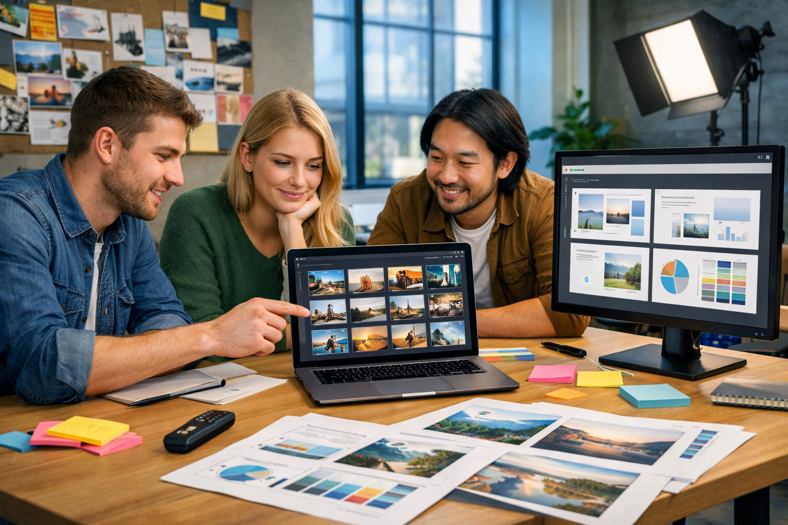
“Wide 16:9 photorealistic modern workspace: tidy desk, laptop showing an AI image generation interface with thumbnail grid (no readable text), designer’s hands selecting visuals, colour palette cards and slide mockups beside it. Composition: clear negative space on the right for bullet points. Lighting: bright soft natural light. High detail, no text, no logos, no watermark.”
D) Process slide (visual metaphor for workflow)
“Wide 16:9 3D render: a simple pipeline of three translucent blocks connected by glowing lines representing ‘idea → prompt → slide-ready image’, minimal background, neutral colours with subtle accent colour. Composition: plenty of empty space for labels to be added later. Studio lighting, clean, no text, no logos, no watermark.”
E) Case study / impact slide (make benefits tangible)
“Wide 16:9 photorealistic scene: small startup team reviewing a presentation on a large monitor, smiling and pointing at a slide with product visuals (no readable text). Office setting with warm golden hour light through windows, professional but relatable. Composition: negative space at top-left for metrics overlay. High detail, no text, no logos, no watermark.”
F) Section divider (simple, memorable, uncluttered)
“Wide 16:9 minimalist abstract background: soft gradient with subtle geometric shapes, gentle shadows, calm neutral palette with one accent colour. Large empty centre area for section title. Clean, high resolution, no text, no logos, no watermark.”
Practical image specs for slide decks (size, format, and quality)
To keep decks crisp, aim for images that match your slide aspect ratio and have enough resolution for large screens.
- Aspect ratio: 16:9 for most modern decks.
- Resolution: 1920×1080 is a solid baseline; higher is better if you’ll crop.
- File format: PNG for sharp edges/graphics; JPG for photos to keep file size down.
- Compression: keep an eye on deck size if you’re emailing it—optimise images after selection.
If your slides will be reused, generate a slightly higher-resolution master set so you can crop for different layouts without quality loss.
Common mistakes (and how to fix them)
Mistake 1: Busy images that fight the text
Fix: prompt for “minimal background”, “shallow depth of field”, “clean negative space”, and put the subject to one side. If needed, add a subtle dark overlay on the slide itself to increase contrast.
Mistake 2: Inconsistent style across slides
Fix: create a “style line” and reuse it in every prompt (e.g., “photorealistic editorial, soft natural light, neutral palette with teal accents”). Save 2–3 approved prompts as your house style.
Mistake 3: Unclear focal point
Fix: name the subject explicitly and reduce competing objects. Add “single focal point” and specify framing (close-up, medium shot, wide shot).
Mistake 4: Accidentally generating text inside the image
Fix: include “no text, no letters, no watermark, no logos” in your prompt. For UI screens, ask for “interface elements and charts without readable text”.
Mistake 5: Overly literal metaphors
Fix: keep metaphors subtle and professional. For “growth”, consider a clean upward trend line on a device screen (no numbers) rather than a cartoon rocket. Your audience should feel “this is credible”.
A fast workflow: from slide outline to finished visuals
Here’s a simple workflow you can repeat for any deck—sales, training, investor pitch, or internal updates:
- Outline slides: write one sentence per slide (the single takeaway).
- Assign an image role: hero/support/metaphor.
- Write one “style line”: reuse across the deck.
- Generate 4–8 variations: pick the clearest and cleanest.
- Drop into slides and test: check text contrast and cropping.
- Final pass: ensure consistent colour mood and visual density.
With Gen AI Last, you can keep everything in one place: generate the visuals, then use AI text generation to tighten slide copy and speaker notes, all via our AI content tools.
How Gen AI Last helps you build presentation assets end-to-end
Presentation work is rarely “just images”. You also need messaging, structure, and sometimes multimedia. Gen AI Last is designed for small teams that want professional output without juggling multiple subscriptions:
- AI Image Generation: create marketing visuals, slide backgrounds, product scenes, and social-ready graphics to promote the deck.
- AI Text Generation: produce slide outlines, speaker notes, executive summaries, and follow-up emails.
- AI Audio Generation: generate voice-overs for narrated decks or training presentations.
- AI Video Generation: turn key slides into short explainer clips or social reels.
All features are available from a single plan, which is particularly useful when you’re producing a deck plus launch assets. You can view pricing from $10/month and scale up only if and when you need longer access.
Use cases: AI images for different presentation types
Sales decks
Generate visuals that mirror your customer’s environment (retail floor, warehouse, clinic, construction site) so your solution feels immediately relevant. Keep images clean with space for ROI bullets.
Investor pitch decks
Prioritise credibility: modern but restrained imagery, consistent lighting, and realistic scenes. Use AI images to illustrate the market context and product usage without looking like generic stock.
Training and internal comms
Use friendly, inclusive visuals that match your audience. Consider an illustration style if you need to depict sensitive scenarios or avoid photorealistic representations of employees.
Conference talks
Go bolder: strong focal points, high contrast, and minimal detail so images read clearly on large screens from the back of the room.
Quick checklist: slide-ready AI image quality
- 16:9 aspect ratio and enough resolution for your screen size
- Clear focal point (one subject)
- Negative space reserved for text
- Consistent style line across the deck
- No accidental text/logos/watermarks in the image
- Works when slightly cropped and when viewed small
Conclusion: generate better presentation visuals in minutes
Learning how to generate AI images for presentations is less about “art” and more about clarity: define the slide’s job, prompt for composition and negative space, keep style consistent, and iterate quickly. Once you adopt a repeatable prompt structure, you can produce slide-ready visuals on demand—without settling for stock imagery that doesn’t fit.
If you want an all-in-one workflow for decks and the assets around them, explore our AI content tools or start creating for free to generate your first set of presentation images.
Ready to Create with Generative AI?
Join thousands of creators using Gen AI Last to generate text, images, audio, and video — all from one platform. Start your 7-day free trial today.
Start Free — Try 7 DaysQuick Links
Create AI content from $10/month
View Plans