How to Use AI for Ebook Cover Design (Step-by-Step Guide)
AI can help you create a professional-looking ebook cover in hours instead of weeks—without needing advanced illustration skills. The key is using AI for what it does best (concepts, style exploration, fast iterations) and then applying simple design rules (genre cues, clear typography, correct dimensions) to make the cover sell. This guide shows exactly how to use AI for ebook cover design, from planning and prompt writing to exporting a Kindle-ready file.
Why ebook covers matter (and where AI fits)
Your cover is your most important marketing asset on Amazon, Kobo, Apple Books, and your own site. Readers decide in seconds whether a book matches their genre expectations and quality standards—often from a small thumbnail. AI image generation is ideal for quickly producing multiple visual directions so you can test what works before committing to a final design.
A good AI-assisted workflow usually looks like this: you define the brief, generate several image concepts, select the best, refine or regenerate until it’s consistent, then add typography and finishing touches. If you’re using Gen AI Last, you can combine image generation with AI text tools for blurbs and ad copy, plus audio/video tools for trailers and ads using the same visual theme. Explore our AI content tools to keep everything consistent across your launch.
Step 1: Define a cover brief that AI can actually follow
Before you generate anything, decide what the cover must communicate. AI outputs improve dramatically when you provide constraints instead of vague ideas.
- Genre and sub-genre (e.g., cosy mystery, grimdark fantasy, contemporary romance).
- Primary promise (e.g., “small-town second-chance romance”, “high-stakes cyber-thriller”).
- Core imagery (character, object, setting, or symbol).
- Mood and palette (warm, pastel, neon, monochrome, cinematic contrast).
- Target platform (ebook only vs ebook + print) and trim size if print is planned.
Practical example: For a cosy mystery, you might choose: a quaint village street, warm lighting, a curious cat, a subtle clue item (a key or envelope), and a friendly illustrated style. For a techno-thriller: a silhouetted figure, city at night, neon reflections, glitchy textures, and a sharp cinematic look.
Step 2: Do “genre research” in 10 minutes
AI can generate beautiful images that still fail to sell because they don’t look like the genre. Spend 10 minutes reviewing the top 20 covers in your category and note patterns:
- Typography style (serif vs sans, bold block titles, script fonts for romance).
- Composition (central character, object focus, wide scenic backgrounds).
- Colour trends (pastels for cosy, high contrast for thrillers, jewel tones for fantasy).
- Common motifs (daggers and crowns for epic fantasy; couples for romance; silhouettes for thrillers).
Turn your notes into a mini checklist: “My cover needs X typography vibe, Y palette, and Z focal point.” This will guide your prompts and help you reject outputs that look pretty but off-market.
Step 3: Choose the right cover format and dimensions
Most ebook stores accept a JPEG or TIFF, but requirements differ. Amazon KDP commonly recommends a cover ratio around 1.6:1 (height:width). A widely used ebook size is 1600 × 2560 px (or larger, keeping the same ratio). If you plan print later, you’ll also need a full wrap (front + spine + back) based on trim size and page count.
AI images are often generated in standard aspect ratios, so you may generate a larger portrait image and then crop/extend as needed. If your tool allows, generate in a portrait-friendly aspect ratio. When in doubt, generate slightly wider than you need so you can crop safely without cutting off focal elements.
Step 4: Write prompts that produce “cover-ready” images
The biggest shift when learning how to use AI for ebook cover design is thinking like an art director. Your prompt should specify subject, style, composition, lighting, and what to avoid. The goal is an image with clear focal area and negative space for the title and author name.
A cover prompt template you can reuse
Use this structure and swap the brackets:
- Subject: [character/object/scene] doing [action] in [setting].
- Genre cues: [motifs], [wardrobe], [era/tech level].
- Composition: centred focal point, clear upper third for title, minimal clutter.
- Style: photorealistic / painterly / illustrated / cinematic, plus references (not brand names) like “vintage pulp”, “watercolour storybook”.
- Lighting & colour: warm dusk / neon night / soft natural light, palette notes.
- Quality constraints: high detail, sharp focus, no text, no watermark, no logo.
Example prompts by genre (ready to paste and adapt)
Romance (contemporary): “Two adults standing close on a rainy city street at night, soft bokeh lights, subtle emotional tension, stylish coats, cinematic romantic mood, pastel neon reflections, shallow depth of field, centred composition with clean space at top for title, photorealistic, high detail, no text, no logos, no watermark.”
Fantasy (epic): “A lone warrior on a cliff overlooking a vast valley, distant castle and storm clouds, ornate cloak and sword, dramatic cinematic lighting, rich jewel tones, painterly realism, strong silhouette, negative space in upper sky for title, high detail, no text, no watermark.”
Thriller (tech): “A hooded figure reflected in a wet street, futuristic city skyline, blue and magenta neon, subtle glitch textures, high contrast shadows, minimal background clutter, strong central focus, clean space for typography, photorealistic, high detail, no text, no logo, no watermark.”
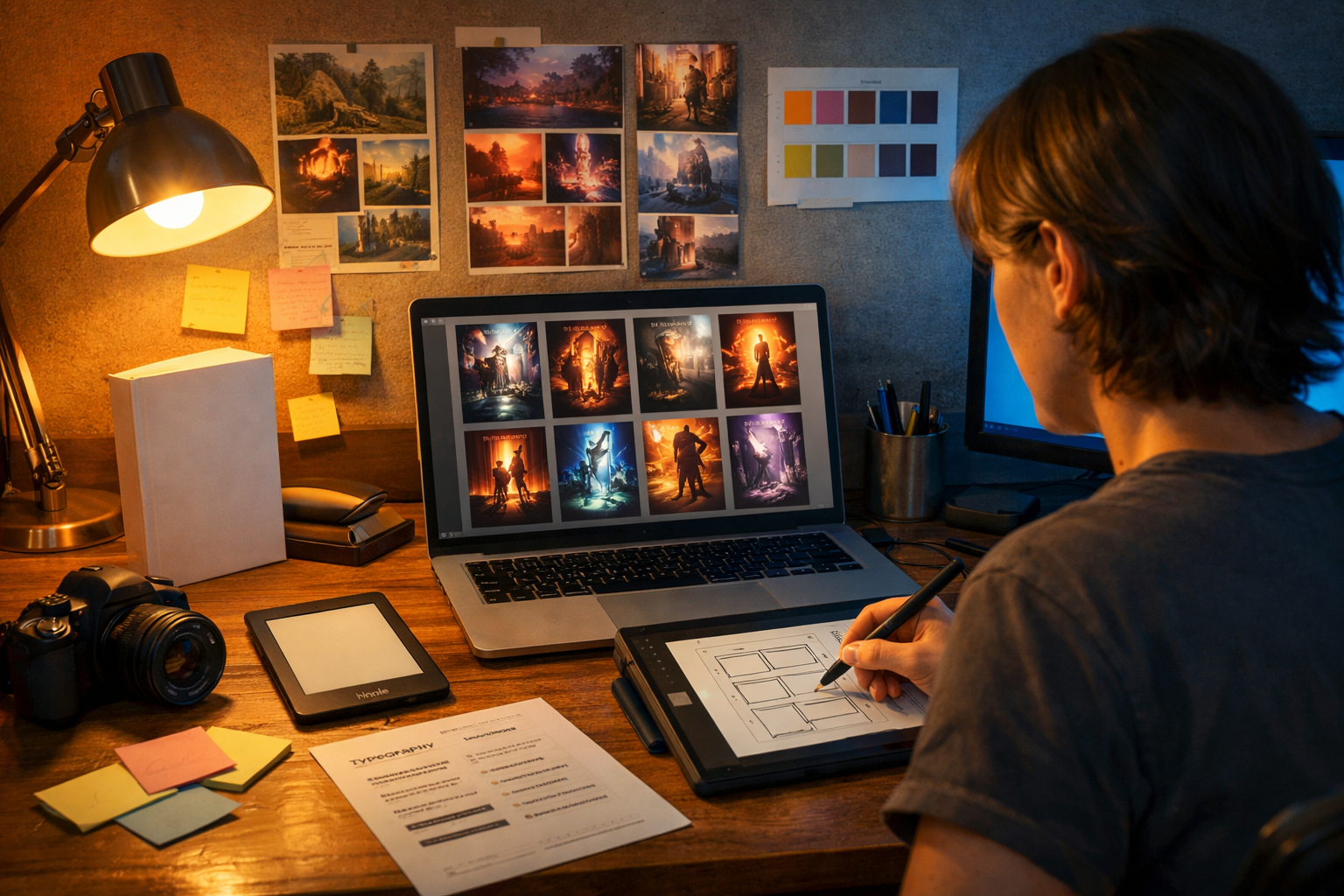
Step 5: Generate multiple variations and score them
Instead of hunting for a single perfect image, generate 10–30 variations and shortlist. Use a simple scoring system so you don’t choose based purely on taste.
- Thumbnail clarity: does the focal point read when zoomed out?
- Genre accuracy: would the right reader recognise the category instantly?
- Typography space: is there clean space for title/author?
- Professional finish: no odd anatomy, warped objects, or confusing perspective.
If you find one variation with the right mood but flaws in details, regenerate with tighter constraints: specify “hands out of frame”, “no extra fingers”, “simple background”, or switch to an object-based concept (symbols and environments often produce fewer errors than full characters).
Step 6: Refine the winning concept (without losing consistency)
AI covers often fall apart when you try to “fix everything” at once. Refine in stages:
- Lock composition: keep the same framing and focal point.
- Control the palette: explicitly describe dominant colours and lighting.
- Simplify: remove unnecessary objects that compete with the title.
- Increase cover-readiness: request “clean background gradient” or “open sky area”.
A common pro trick is to aim for a strong background image first, then add a clearer subject later (or vice versa). The less visual noise, the easier typography becomes.
Step 7: Add typography that sells (the part AI can’t guess for you)
Even the best image will underperform with weak typography. Your title must be readable at thumbnail size, and the font choice must match the genre. Use a simple design tool (or a designer) for this step: AI generates the art; you control the type.
Typography rules for ebook covers
- Prioritise legibility: bold title, high contrast against the background.
- Limit fonts: usually 1–2 font families max.
- Create hierarchy: title largest, author smaller, subtitle optional.
- Use safe margins: keep text away from edges to avoid cropping on devices.
Quick check: zoom your draft out until it’s about the size of an Amazon search result. If you can’t read the title instantly, adjust font weight, size, or contrast (for example, add a subtle shadow or dark overlay behind the text).
Step 8: Make mock-ups and run a fast “reader test”
Before publishing, validate the design with real feedback. You don’t need a big audience—just structured questions.
- Show 3 covers to 10–20 people who read your genre.
- Ask: “What genre is this?”, “Which cover looks most professional?”, “Which would you click?”
- Measure: if fewer than 70% guess the correct genre, revise.
Mock-ups (Kindle screen, phone screen, paperback on a table) help you see contrast and legibility issues that don’t show up on a full-size canvas.
Step 9: Export settings for ebook platforms
Use platform-friendly exports to avoid compression problems. Common best practices:
- File type: high-quality JPG for ebook (unless your platform prefers TIFF).
- Resolution: aim for 1600×2560 px minimum; higher is fine within size limits.
- Colour: sRGB for digital storefront consistency.
- Compression: avoid overly aggressive compression that creates banding in gradients.
If you plan print later, keep a layered working file and export a print-specific version (CMYK, bleed, and spine width calculated from page count) rather than trying to “convert” an ebook cover at the last minute.
Common mistakes when using AI for ebook cover design
AI speeds things up, but it also makes it easy to publish something that looks impressive yet performs poorly. Avoid these traps:
- Choosing art over market: the cover must look like the genre, not like a gallery piece.
- Cluttered composition: too many elements reduce thumbnail clarity.
- Unreadable title: thin fonts and low contrast kill conversions.
- AI artefacts: strange hands, warped architecture, inconsistent shadows—fix or regenerate.
- Relying on AI text in images: AI-rendered lettering is often distorted; add typography yourself.
A simple end-to-end workflow using Gen AI Last
If you want one streamlined process for your entire book launch, Gen AI Last is built for that. You can generate your cover concept art, then create supporting marketing assets in the same style.
- Generate cover concepts: use AI Image Generation to explore 10–30 variations based on your genre brief.
- Write supporting copy: use AI Text Generation to draft your book description, tagline options, and ad headlines.
- Create launch creatives: generate matching social graphics and banners for consistent branding.
- Produce a short trailer: use AI Video Generation to build a simple teaser using your cover art style.
- Add narration: use AI Audio Generation for a trailer voice-over or audiobook-style promo snippet.
All of these tools are included from view pricing from $10/month, which makes it realistic for indie authors and small teams to build a professional-looking launch kit without juggling multiple subscriptions.
Prompt pack: 6 “cover-ready” prompts with built-in negative space
Use these as starting points and replace bracketed terms. Each one includes explicit space for typography.
- Minimal symbol cover: “A single [symbol] floating above a subtle textured background, soft gradient from dark to light, centred composition, large clean space at top and bottom for title and author, premium editorial style, high detail, no text, no watermark.”
- Landscape with sky space: “Wide cinematic view of [setting], horizon low, dramatic sky occupying upper half for title space, [mood] lighting, [palette] colours, high detail, no text, no logos.”
- Character silhouette: “Strong silhouette of [character] in foreground, background softly blurred [city/forest], high contrast rim light, clear negative space in upper third, cinematic, photorealistic, no text.”
- Cosy illustrated scene: “Illustrated storybook style, warm inviting [small town / kitchen / bookshop] scene, clean open area at top for title, simple shapes, gentle texture, no text.”
- Dark academia: “Moody still life on a wooden desk: old book, candle, ink bottle, [mysterious object], soft shadowy lighting, vignette edges, empty darker band at top for title, photorealistic, no text.”
- Sci-fi abstract: “Abstract futuristic geometry, glowing lines and particles, central focal shape, smooth gradient background, clean space at top for typography, neon blue/purple palette, high detail, no text.”
FAQs: how to use AI for ebook cover design
Can AI make an entire ebook cover automatically?
AI can generate the artwork quickly, but you’ll usually get the best results by adding typography yourself so the title is perfectly readable and aligned with genre expectations.
How do I stop AI from adding weird text or symbols?
Tell it explicitly: “no text, no letters, no watermark, no logo”. Also choose concepts that don’t require signage (for example, a symbol, landscape, or silhouette rather than a street full of shop signs).
What’s the quickest way to improve results?
Add composition instructions (negative space for title) and genre cues (wardrobe, motifs, palette). Most “bad” outputs are actually brief problems, not tool problems.
Next steps: create your first AI-assisted cover today
Start with a clear genre brief, generate multiple variations, choose the most market-appropriate concept, and then apply strong typography that stays readable at thumbnail size. Once your cover is ready, use the same visual direction to generate matching blurbs, ads, and promo content so your book launch feels cohesive.
If you want an all-in-one toolkit for cover concepts and launch assets, you can start creating for free and explore image, text, audio, and video generation in one place.
Ready to Create with Generative AI?
Join thousands of creators using Gen AI Last to generate text, images, audio, and video — all from one platform. Start your 7-day free trial today.
Start Free — Try 7 DaysQuick Links
Create AI content from $10/month
View Plans